Aesthetic
and Wellness
Visual Direction & Campaign Identity
- ROLE
- Visual Direction, Illustration, Social Media Design, Motion Graphics
- DURATION
- 6 Months
Show the treatment,
not the model.
An emerging Hong Kong aesthetics studio had an existing logo and a limited startup budget. It needed sophisticated treatment communications without depending on celebrity or model-led photography.
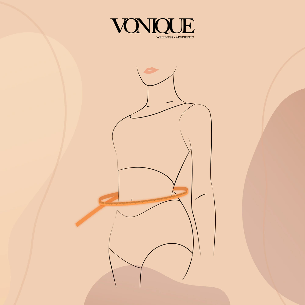
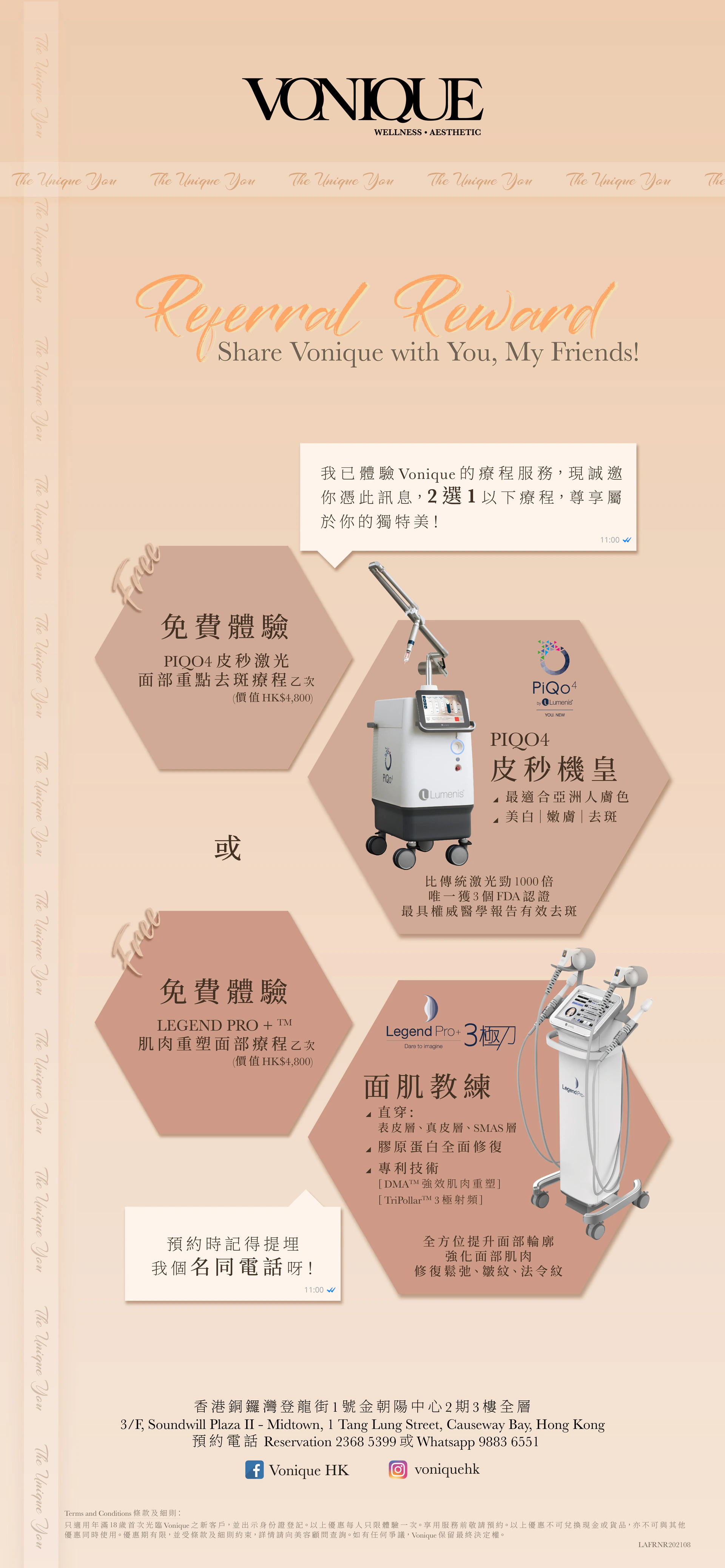
The creative approach put the treatment at the centre of the image. Minimal line illustrations describe areas of focus, while a skin-inspired peach palette and black typography give the campaign a consistent visual language.
Illustration and motion offered a way to communicate treatments across social media while working with the existing identity.
The campaign in motion.
A closing film brings the visual direction onto the screen.
A shared visual language.
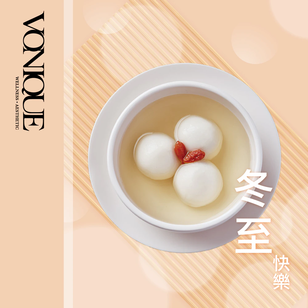
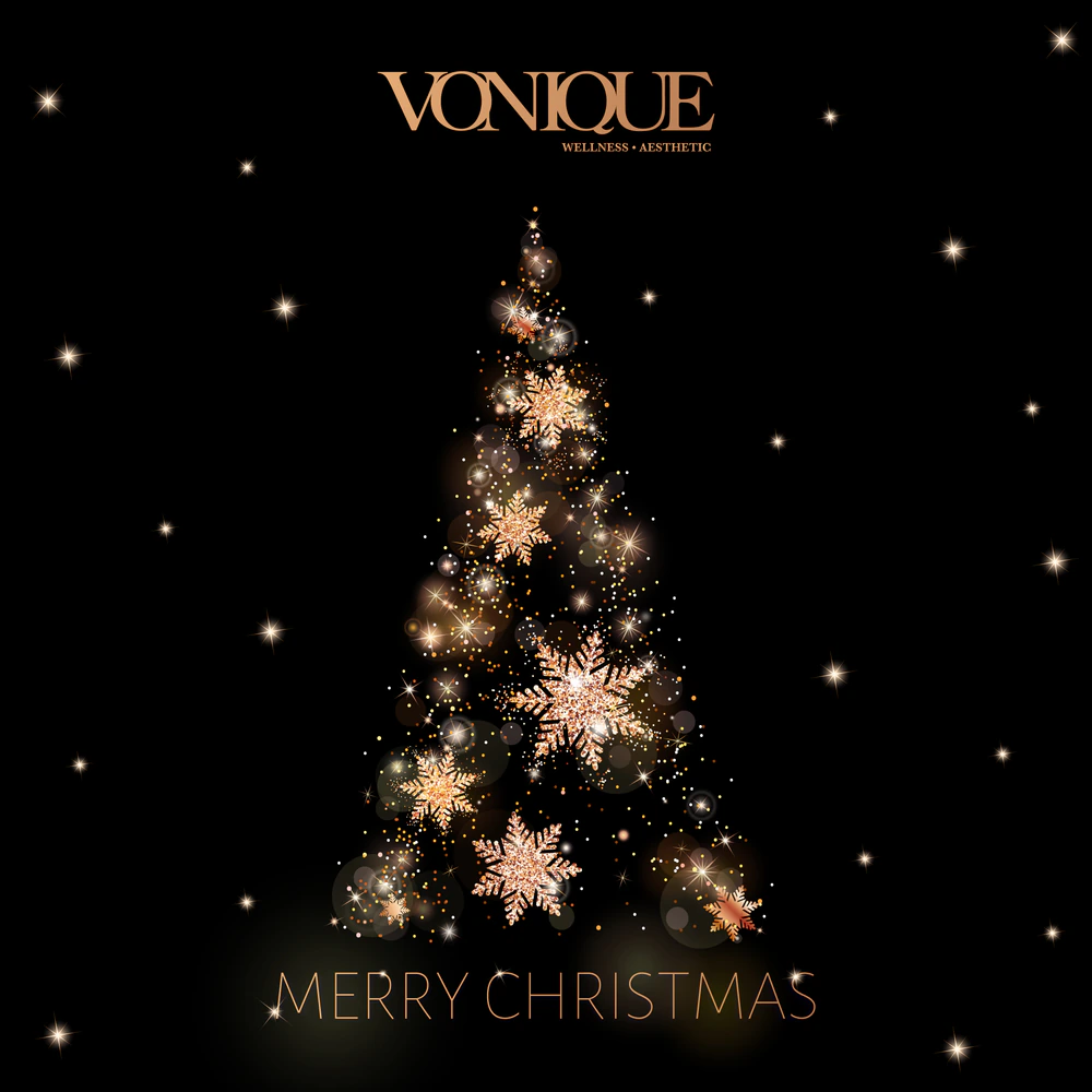
Treatment illustrations and seasonal compositions bring together peach tones, fine linework and considered typography.
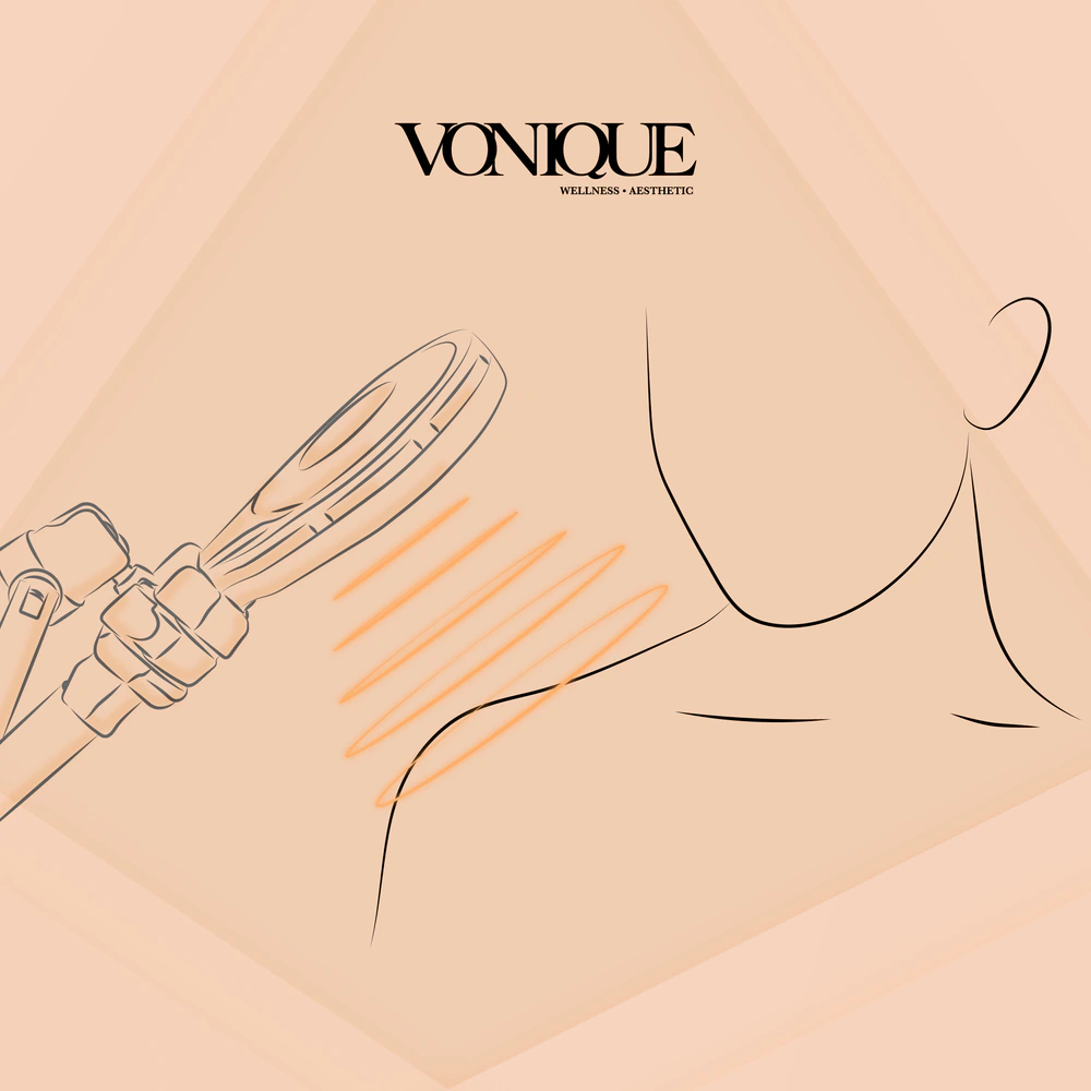
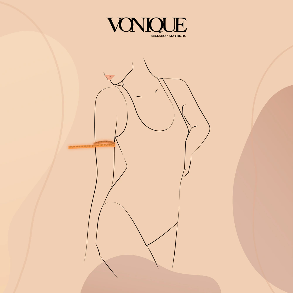
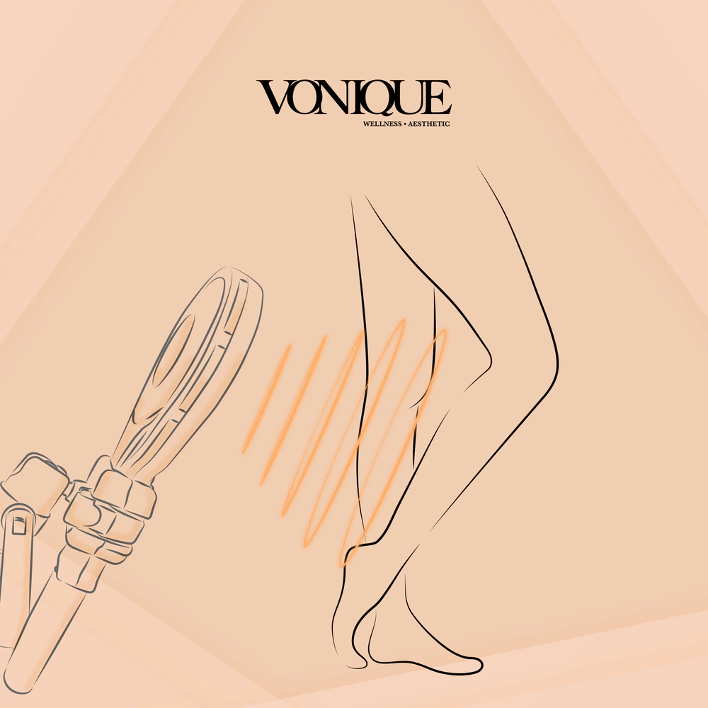
The treatment takes focus.
Three short animations extend the illustration system through movement.
Beyond the social feed.
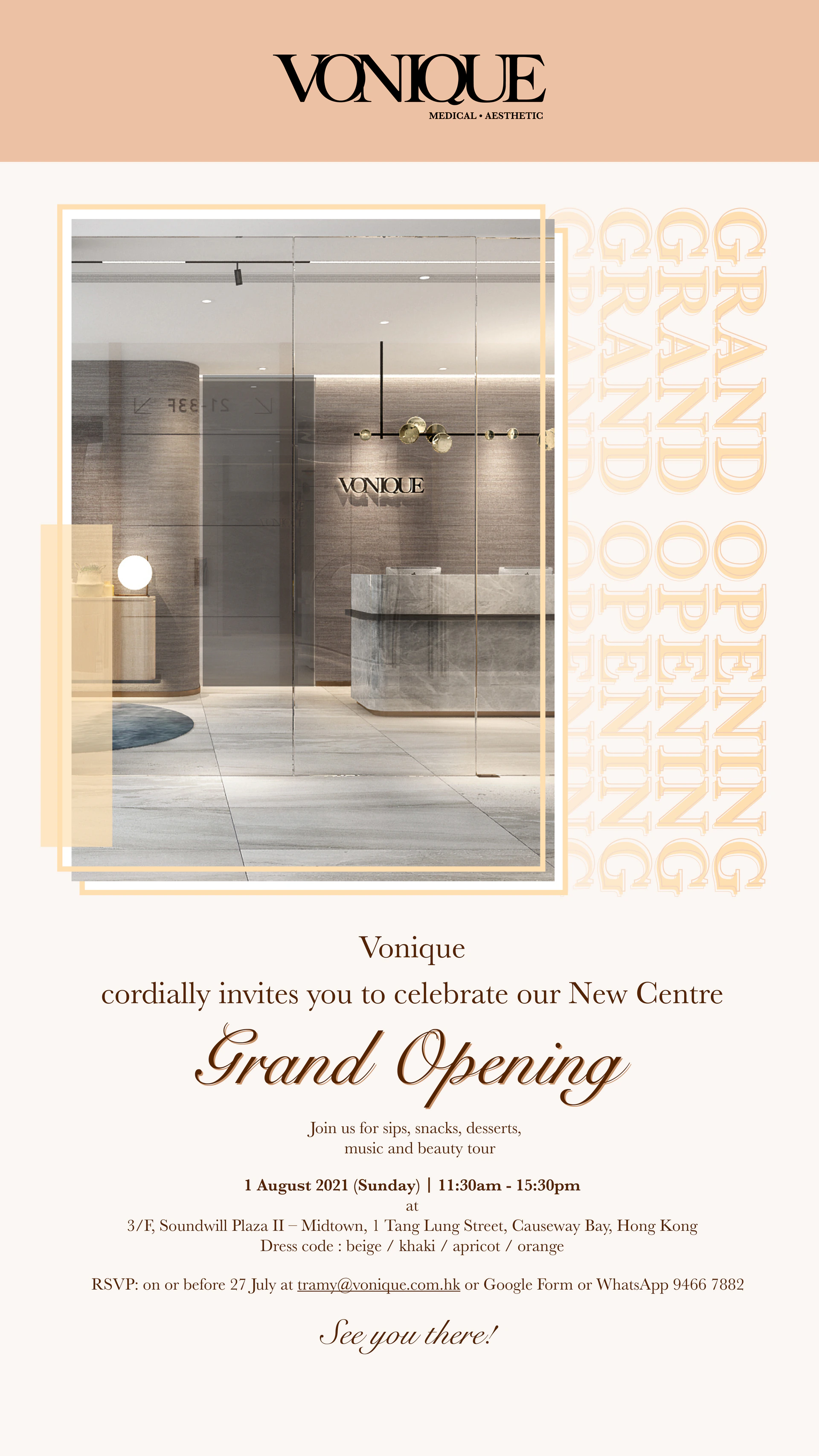
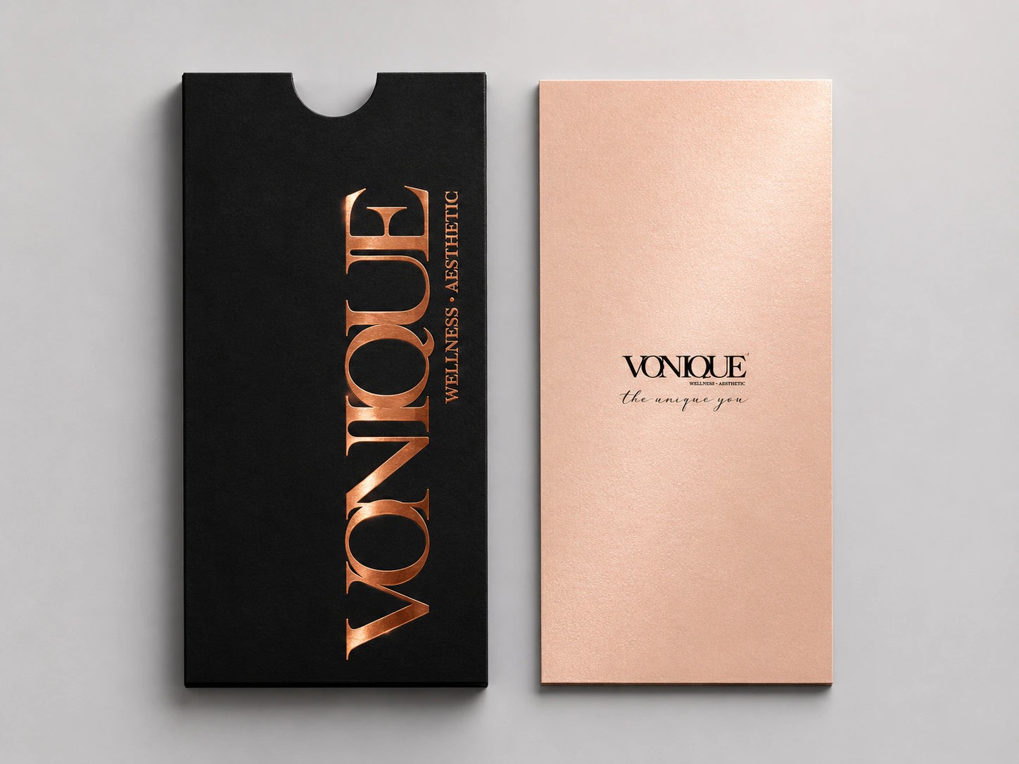
The project also includes EDM and print applications, carrying the warm palette and typographic direction into longer-form communications and physical formats.
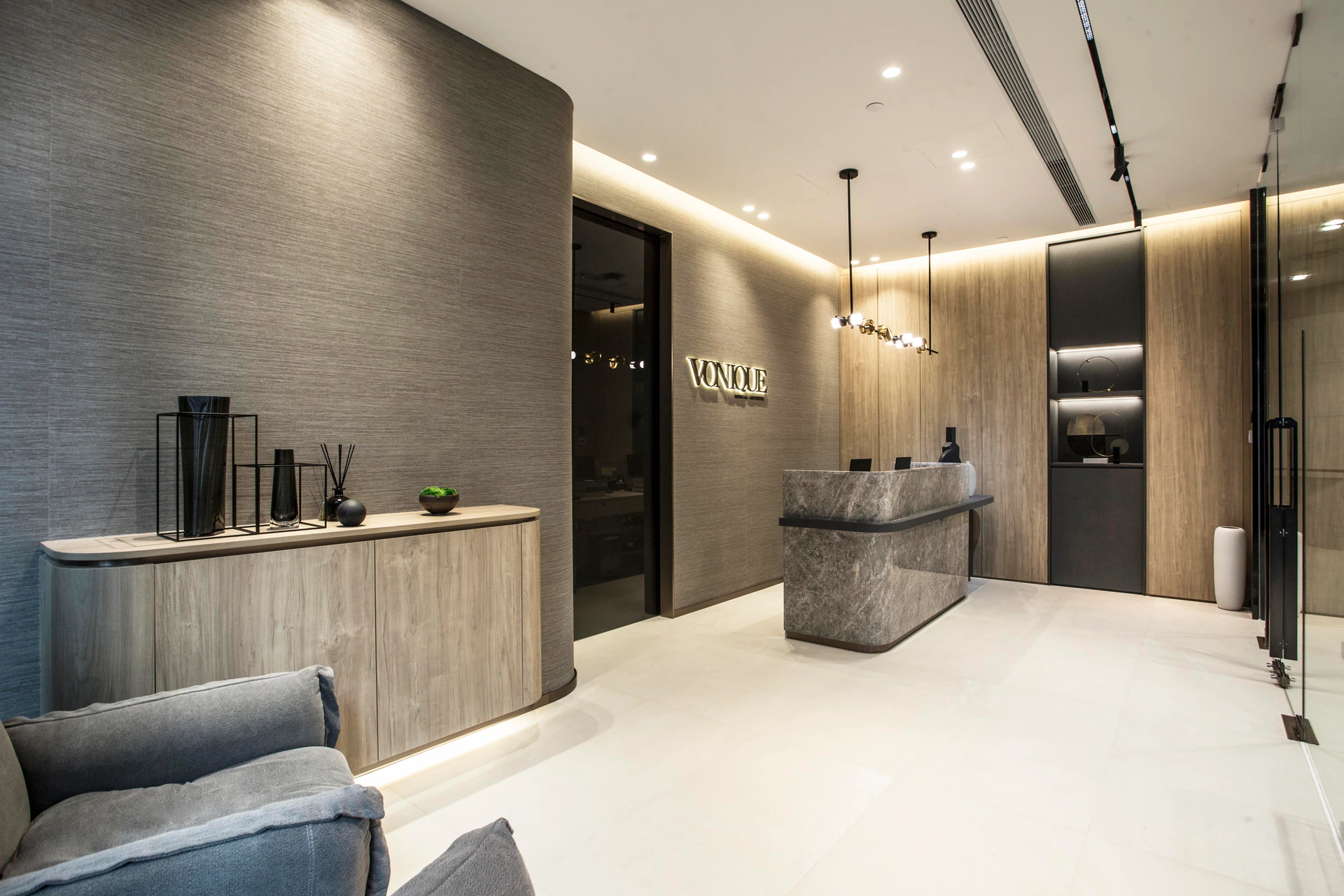
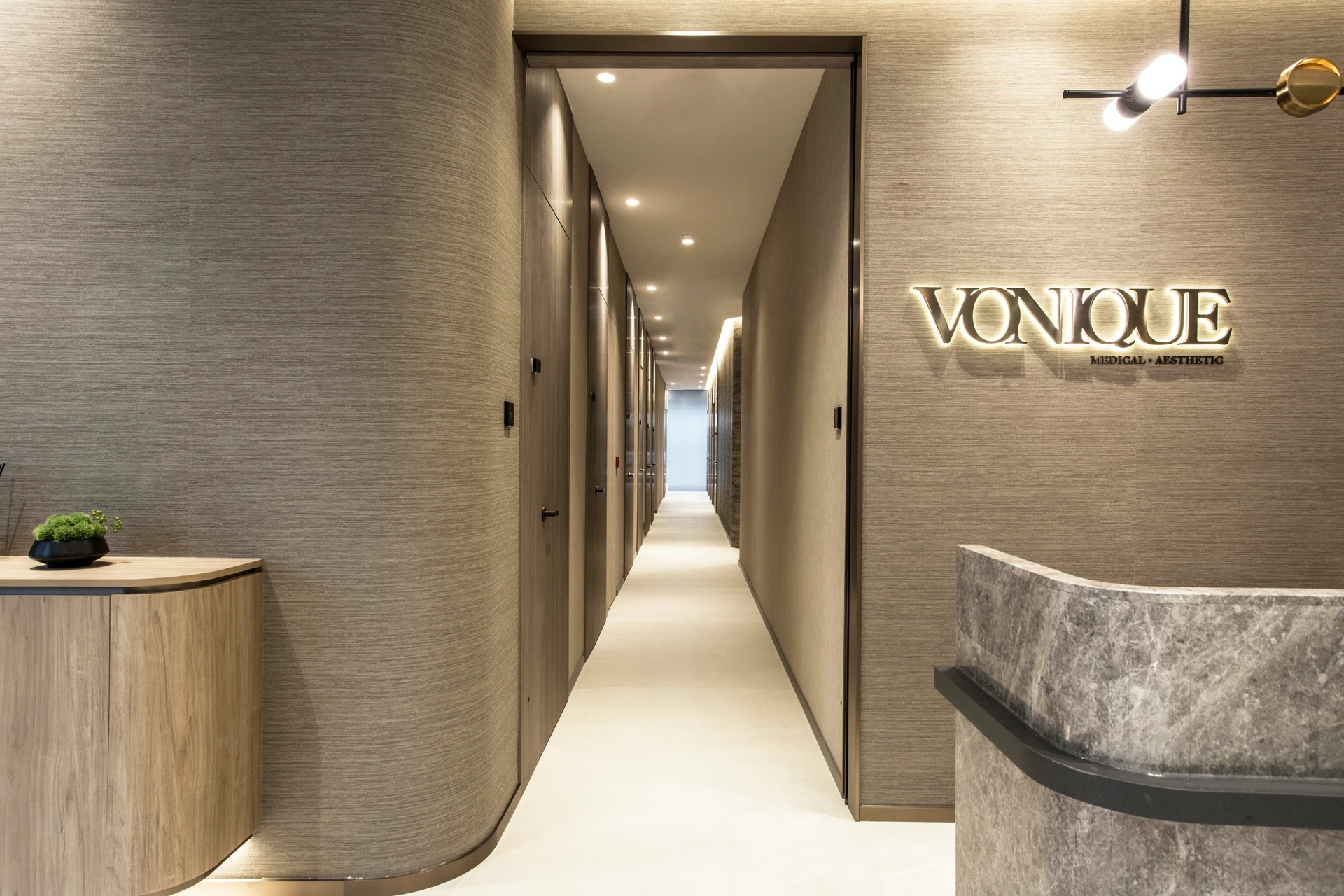
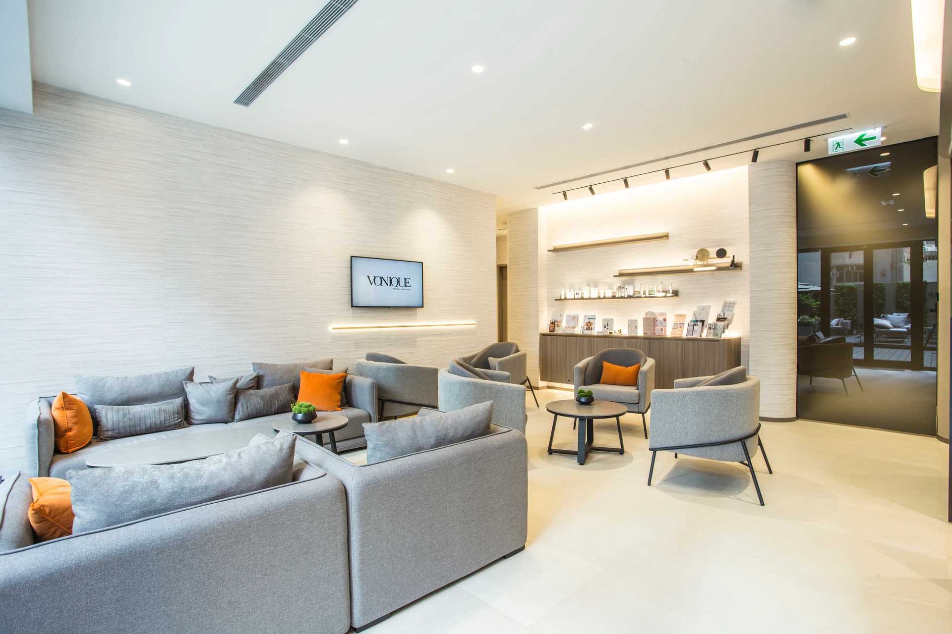
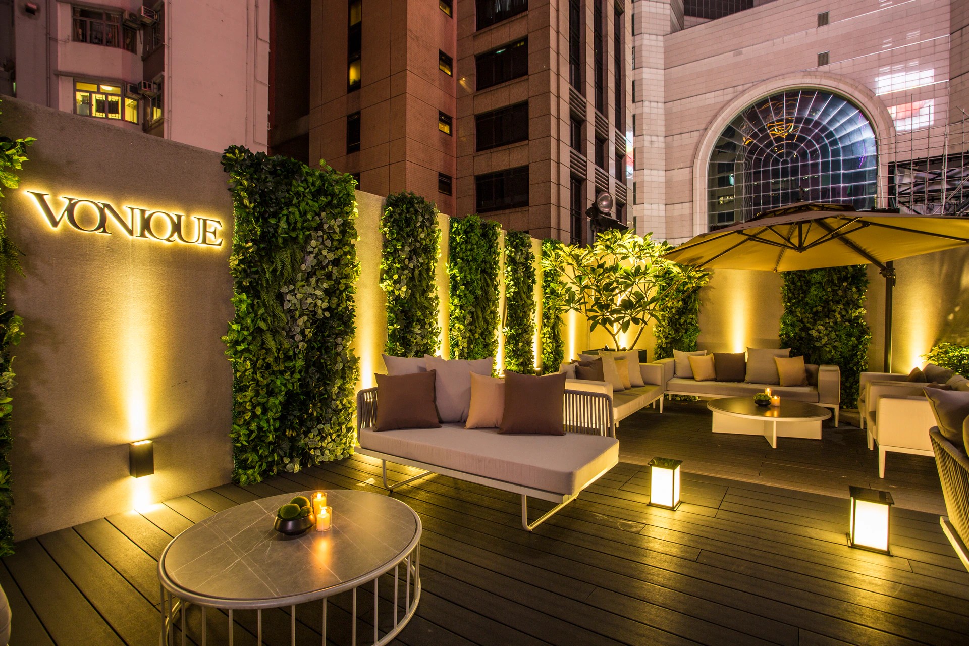
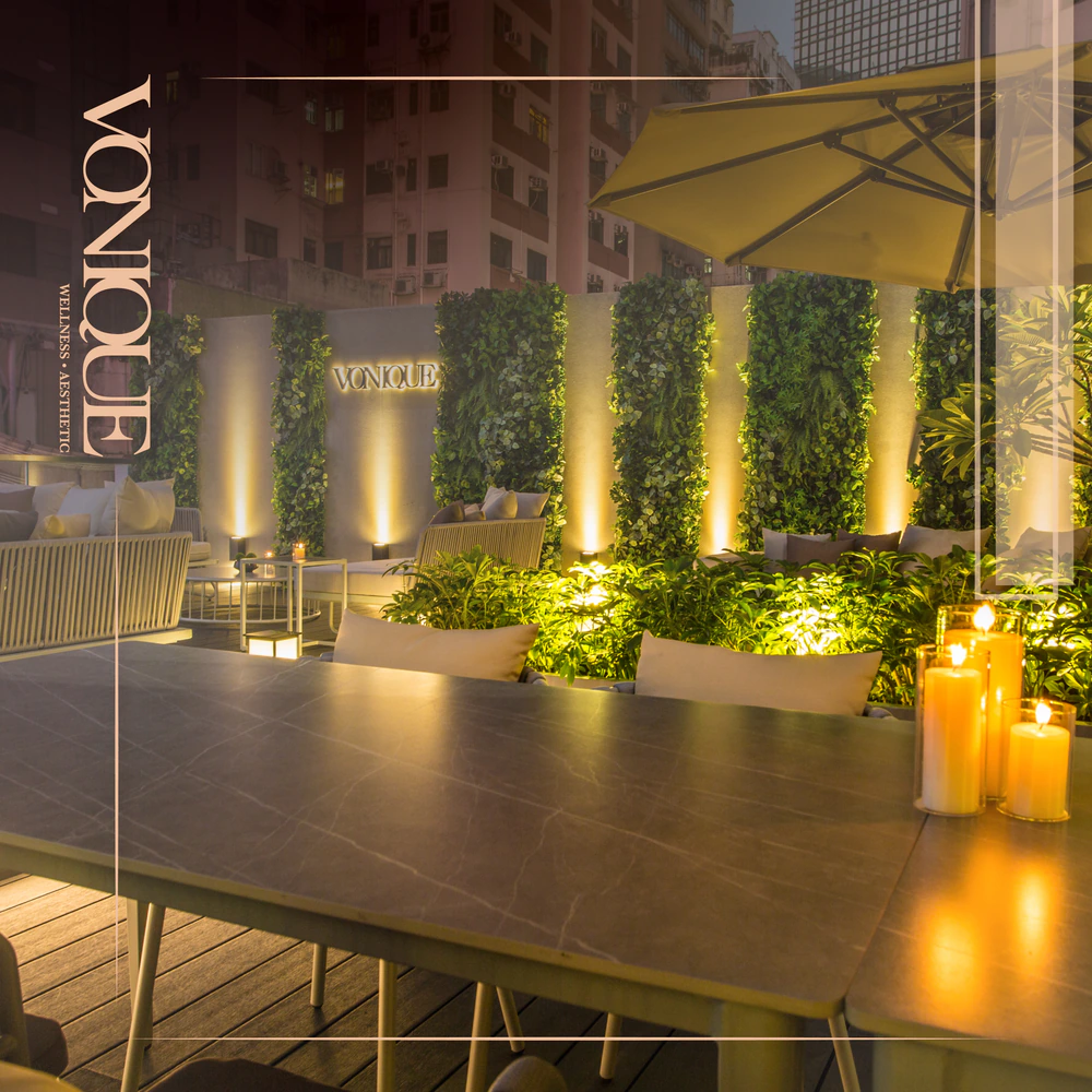
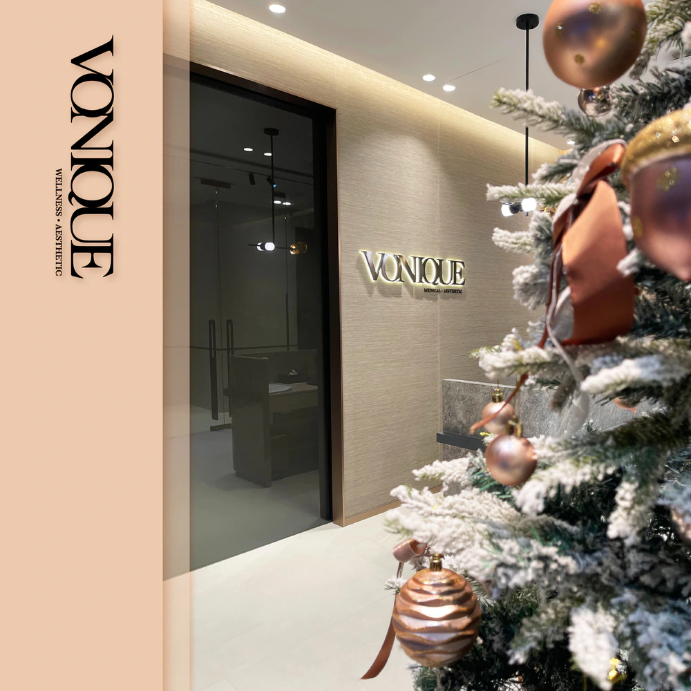
A setting for the experience.
Warm materials, soft lighting and quiet surfaces provide a physical setting for the studio.