01 / 81 KITCHEN
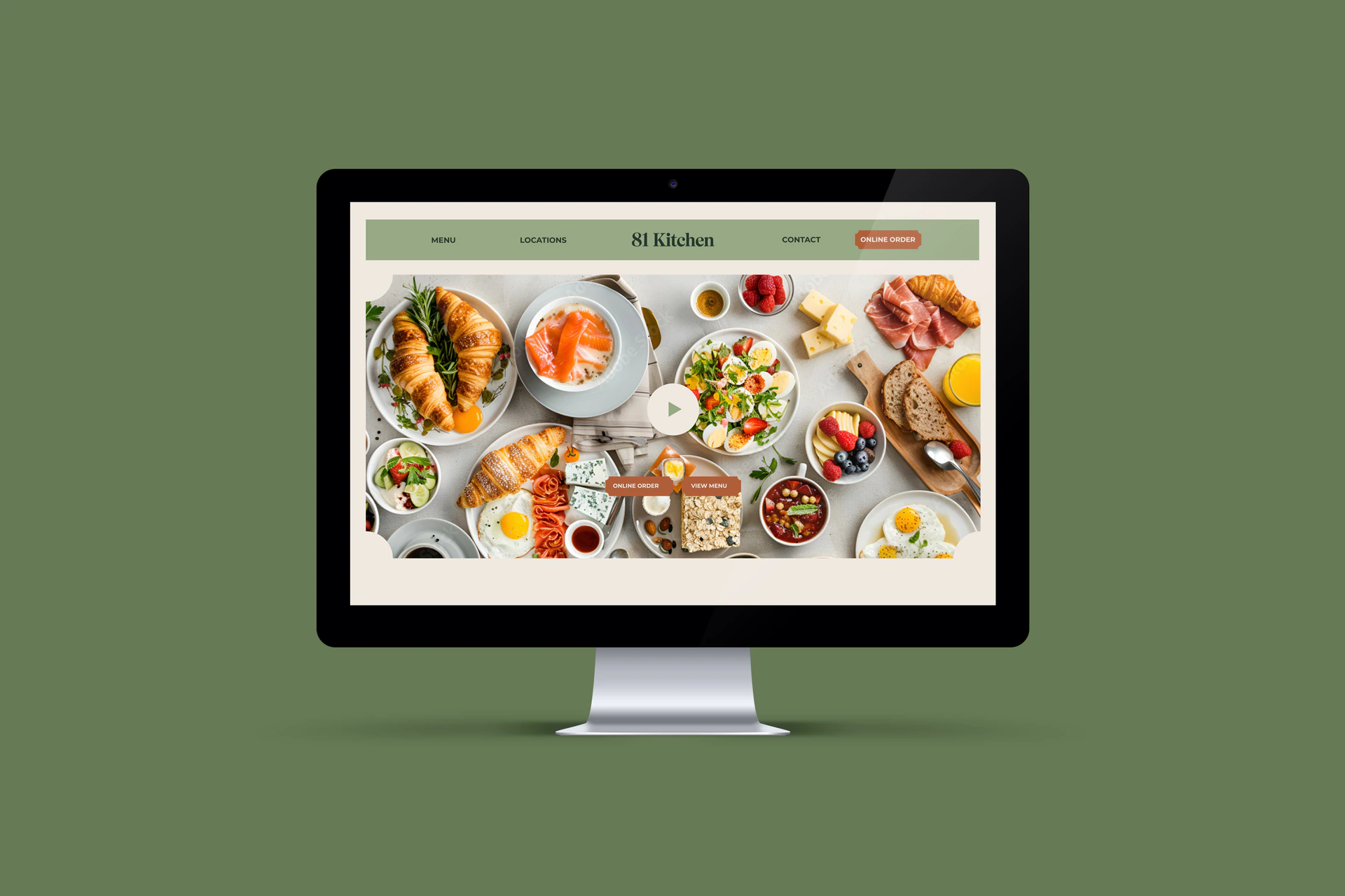
81 Kitchen
Translating brand identity into digital experiences.
81 Kitchen came with an established brand identity and brand guidelines. I designed the website interface from scratch in Figma, translating that existing visual language into a cohesive multi-page desktop website.
The work covers Homepage, Menu, Locations and Contact page designs, with food-led imagery and a consistent approach to typography, colour and page layout.
- ROLE
- UI Design / Visual System / Page Layout
- PLATFORM
- Figma
- CATEGORY
- Website UI Design
- FORMAT
- Desktop website designs
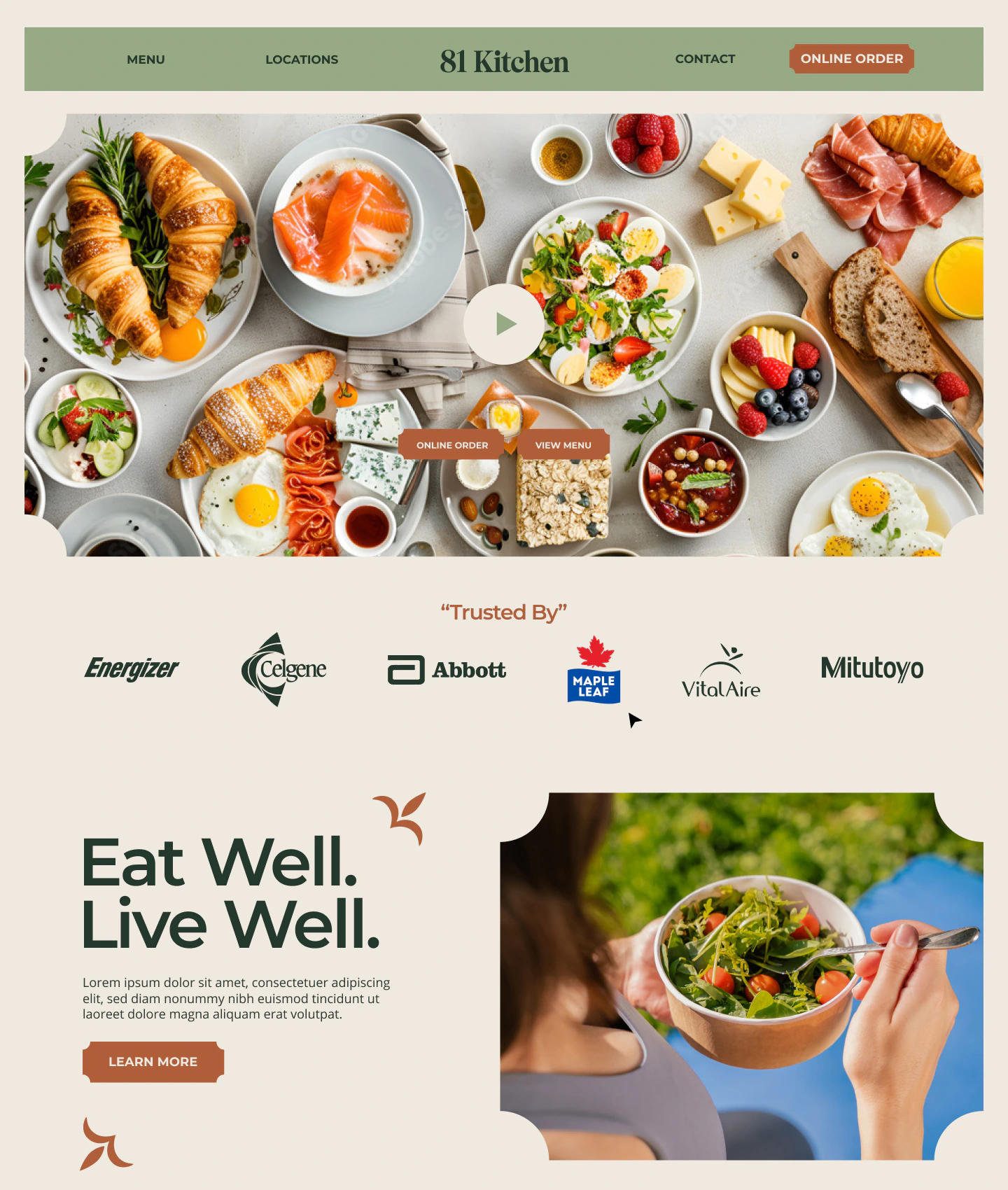
A food-led first impression.
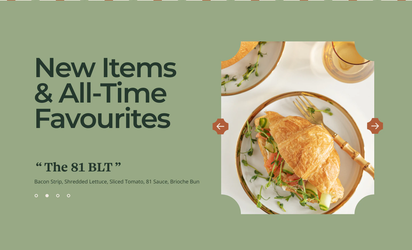
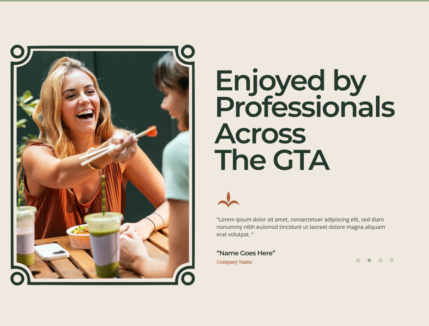
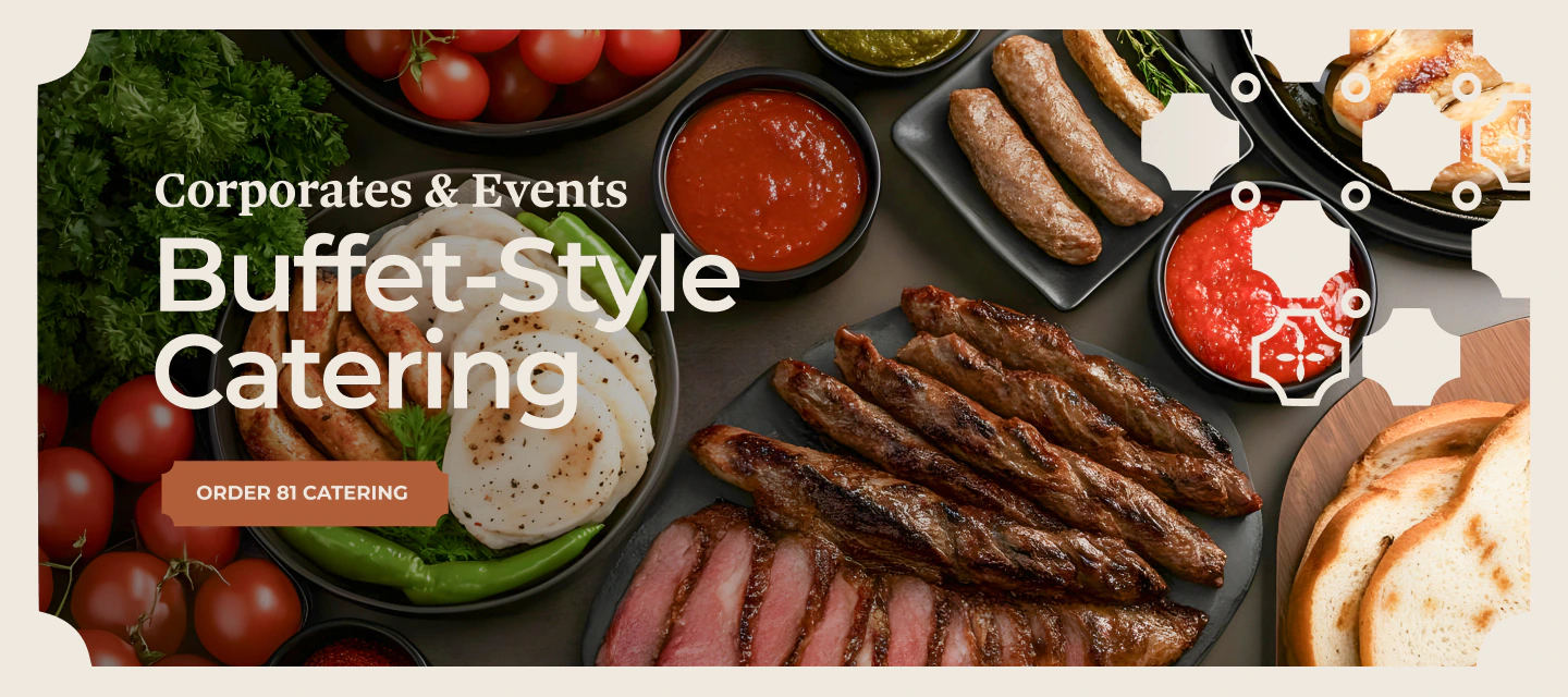
Selected sections from the full-page desktop design, from navigation and the opening food imagery to modular categories and promotional highlights.
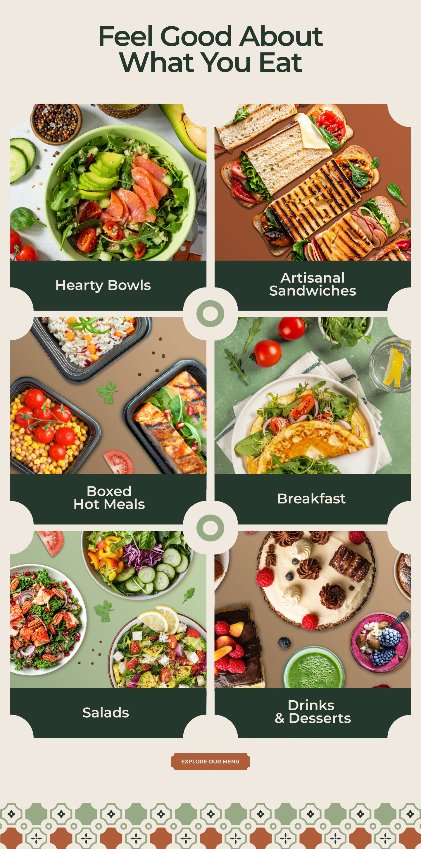
A modular food story.
Food categories share a consistent image treatment and clear labels. The brand’s decorative shapes connect the modules into a single visual language.
Clarity across the journey.
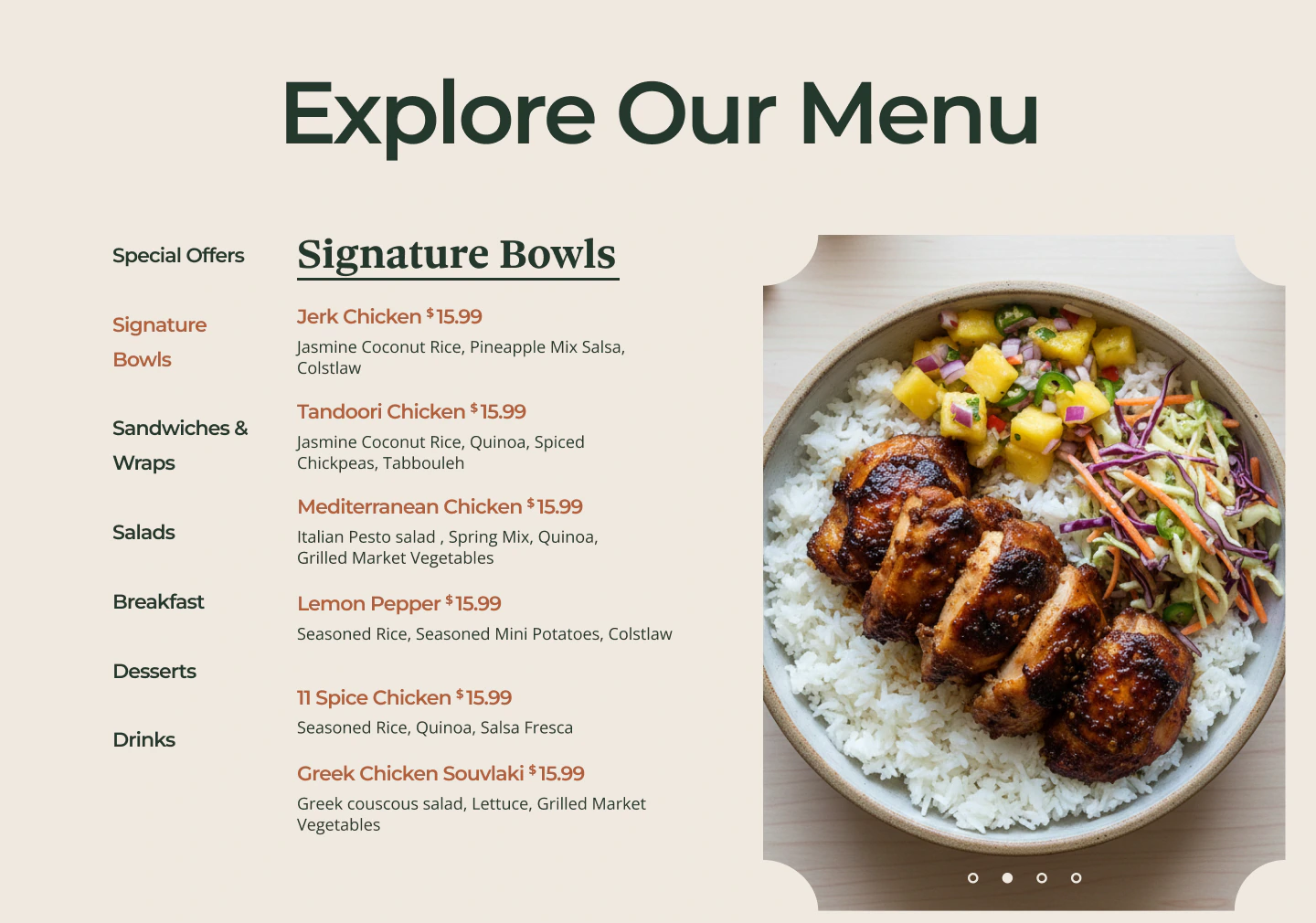
The desktop menu combines product imagery with a clear content hierarchy. Locations and Contact extend the same visual system to practical information.
The menu, introduced.
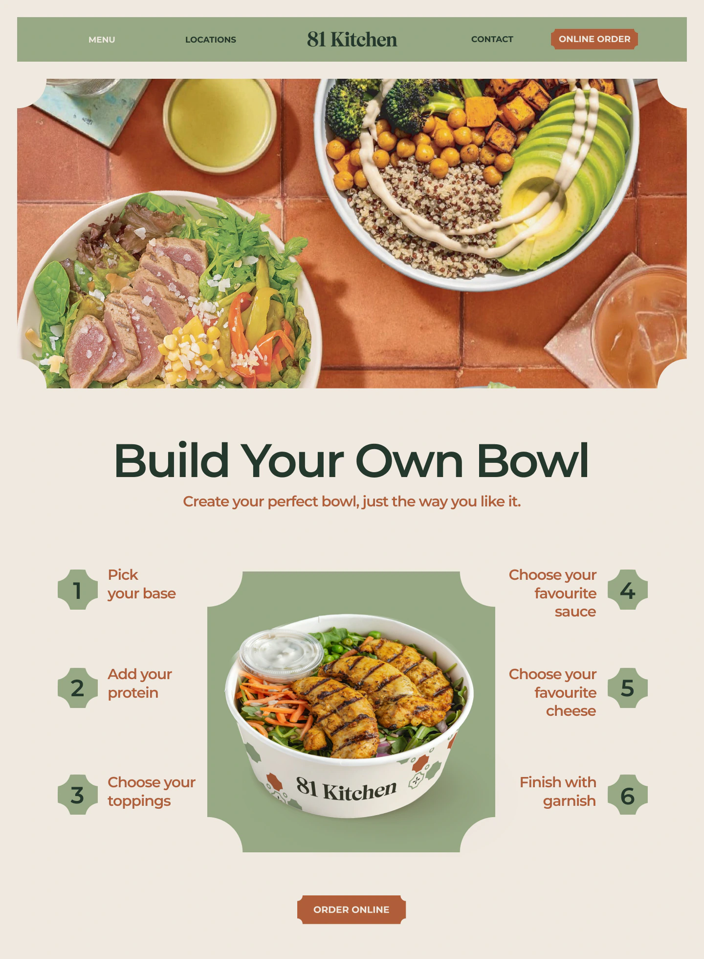
The bowl-builder presentation leads with imagery and a sequence of choices, followed by a category-led menu layout.
The practical details.
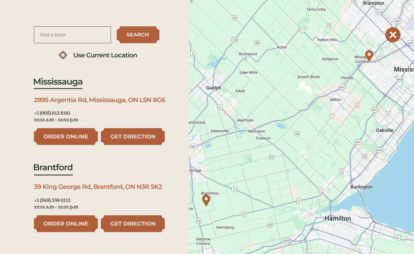
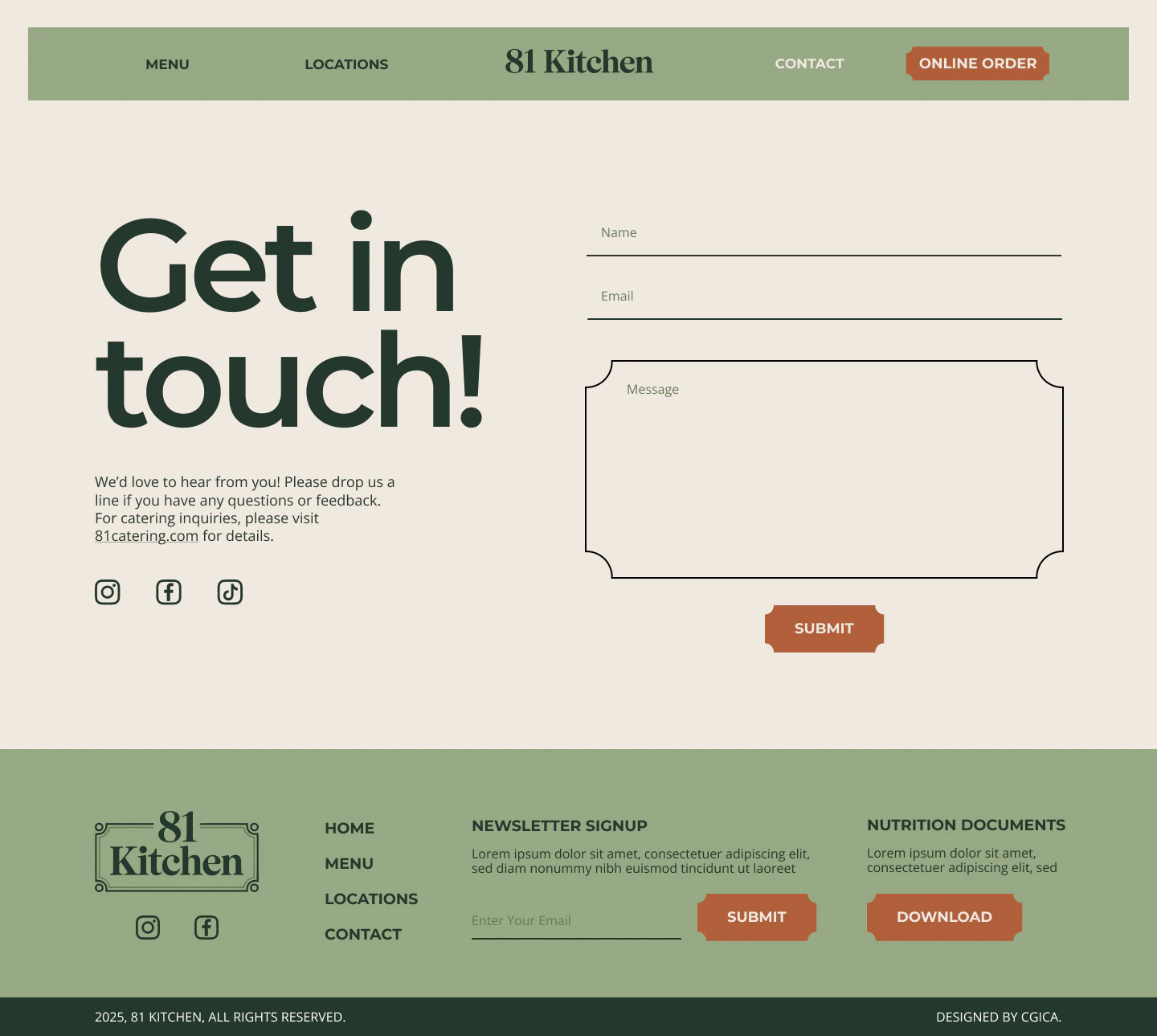
The store locator interface and contact page typography carry the same visual language into useful everyday information.
One identity. A cohesive interface.
Brand translation
The existing brand guidelines informed the desktop UI, carrying established colours, typography and decorative elements into a new digital setting.
Visual consistency
Repeated heading styles, image treatments and graphic details create continuity across Homepage, Menu, Locations and Contact.
Content hierarchy
Distinct sections and clear page layouts separate brand storytelling, menu information and practical details.
Food-led navigation
Prominent food imagery, category labels and a consistent navigation bar help communicate the offer and organise the desktop experience.